Picking the Perfect Brand Colors: A Guide for Signage and Business Success
February 24, 2023
The Benefits of Custom Signage: Why One Size Doesn’t Fit All
March 31, 2023In today’s world, where people are constantly bombarded with advertisements and visual stimuli, it’s crucial for businesses to create signage that stands out and captures customers’ attention. But it’s not just about creating visually appealing signs – understanding the psychology of signage is key to designing effective signs that attract customers. In this post, we’ll dive into the psychology of signage and offer tips on how to design signs that will help you attract customers.
- The Power of Color
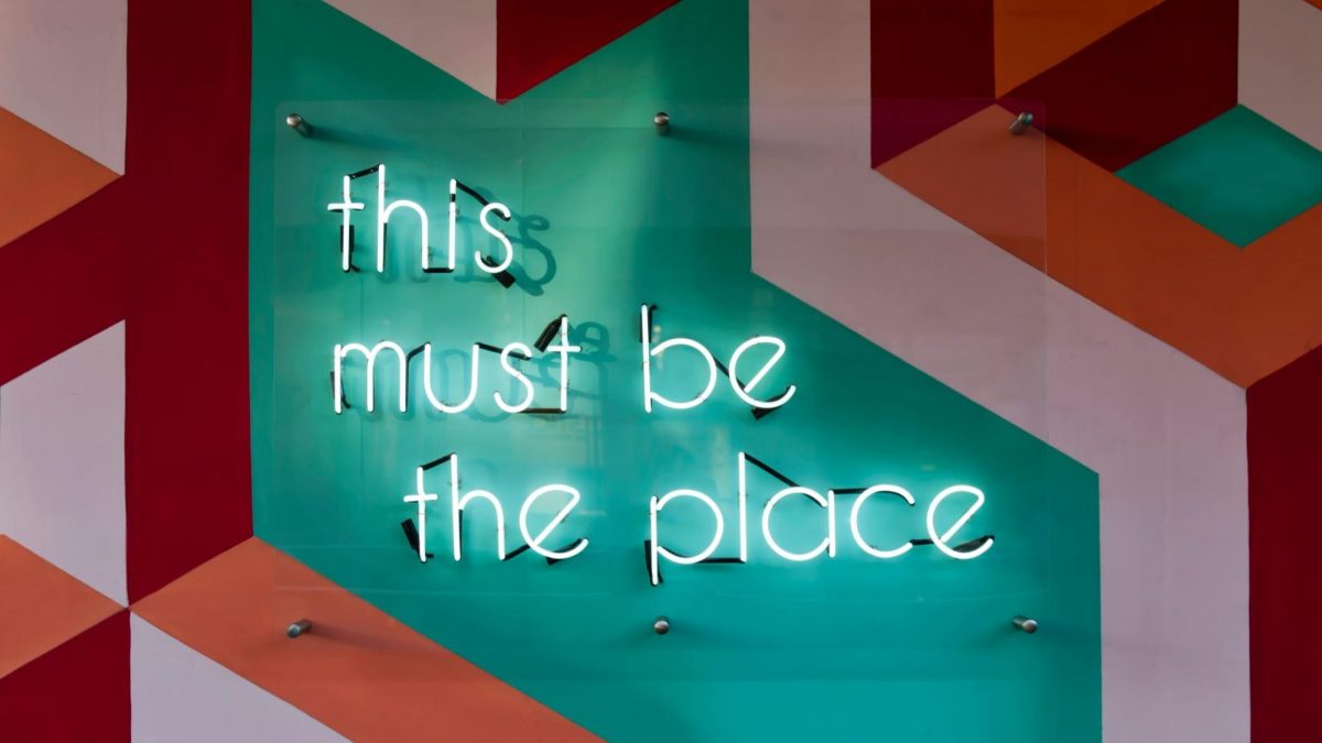
Color is one of the most important elements of a sign’s design. Different colors can evoke different emotions and reactions from viewers. For example, red is associated with passion and excitement, while blue is associated with trust and reliability. Understanding the emotions that different colors can elicit can help you choose the right colors for your sign. It’s also important to consider the contrast between the text and the background of the sign – high contrast can make the sign more visible and easier to read. - Keep It Simple
In a world where people are constantly bombarded with information, simplicity is key. Your sign should be easy to read and understand at a glance. Avoid using too much text, and make sure the text is large enough to be read from a distance. Choose a clear and easy-to-read font, and consider using bullet points or icons to convey information in a more visually appealing way. - The Power of Words
Words are powerful, and the language you use on your sign can have a big impact on how customers perceive your business. Choose words that convey a clear and compelling message about your brand or product. Use action-oriented words to encourage customers to take a specific action, such as “Visit Us Today” or “Shop Now.” It’s also important to keep your target audience in mind when choosing your words – different demographics may respond better to different types of language. - Consider Your Branding
Your sign is a reflection of your brand, so it’s important to ensure that it aligns with your brand’s overall aesthetic and messaging. If you have an established brand, consider using your brand colors and fonts in your sign design. This can help increase brand recognition and reinforce your brand’s identity. If you’re a new business, consider the type of image you want to project and design your sign accordingly. - Consider Your Location
The location of your sign can also have a big impact on its effectiveness. Consider the angle from which your sign will be viewed and design it accordingly. If your sign will be viewed from a distance, make sure the text is large enough to be read from afar. If your sign will be viewed up close, consider using more detailed images or graphics to capture viewers’ attention. - The Importance of Placement
Finally, the placement of your sign is crucial. It should be easily visible from a distance and placed in a location where it will be seen by your target audience. If your business is located on a busy street, consider placing your sign at eye level or above other buildings to increase visibility. If your business is located in a shopping center or mall, consider placing your sign near the entrance to attract customers as they enter.
Designing effective signage requires an understanding of the psychology of signage. By considering the power of color, keeping it simple, using the right words, aligning with your branding, considering your location, and placing your sign strategically, you can design signs that attract customers and help grow your business. By following these tips, you can create signage that captures viewers’ attention and encourages them to take action.


